Grids are one of the more complex UI controls to work with in Fluid. This is because grids by design are in a tabular format which is not very conducive to responding to small form factors (particularly when there are a several columns).
I learnt a lot about grids in Fluid UI while chatting with Stefan van Liempt from CY2. He is one of the top Fluid developers and has several innovative ideas and designs. Watch his blog space here for interesting posts on Fluid (many more to come in the future)!
The following presentation on UI Controls is a must read for anyone who is starting to learn Fluid:
http://cy2.nl/wp-content/uploads/10-Fluid-UI-controls-you-should-know-about.pdf
In this post, I would like to share what I learnt from Stefan's presentation and how one of my colleagues used 'stacked columns' to create responsive grids simply by using Page Field Properties! At the end, I will share a project containing the demo pages with grids detailed in this post.
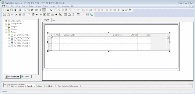
Classic Grid Layout:
To start off, I created a simple Fluid page containing a Grid with a 'Classic Grid Layout'.
Demo:
We can see that the 'Classic Grid Layout' in Fluid simply creates a grid much like in Classic UI. The grid is not responsive.

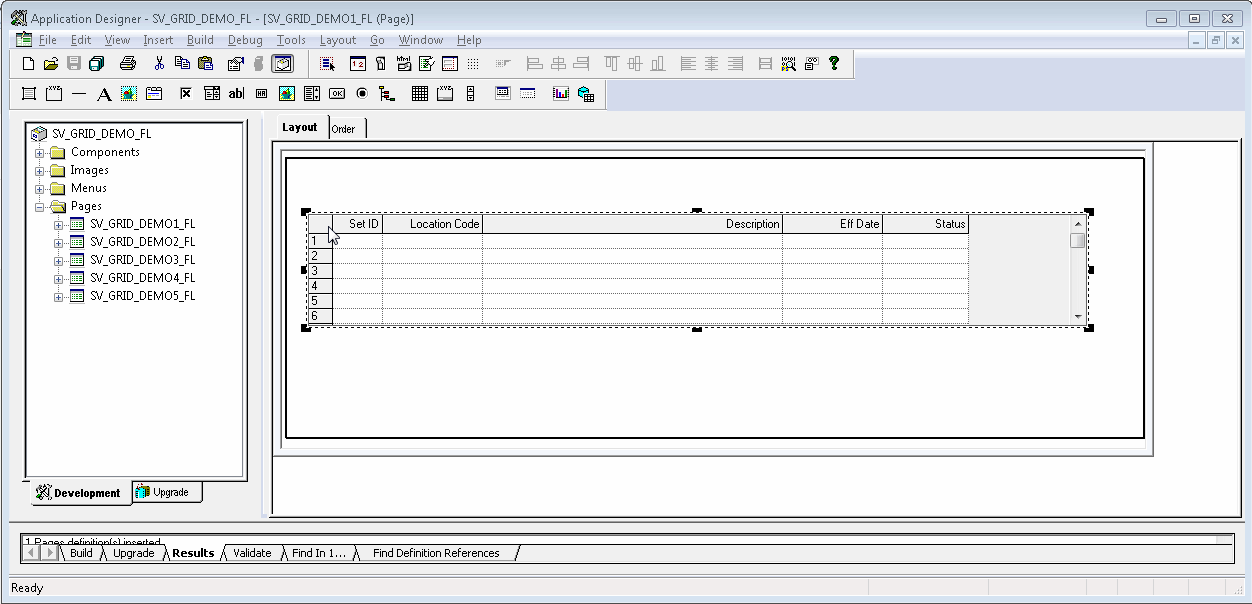
Flex Grid Layout:
Next, I changed the Grid Properties to use a 'Flex Grid Layout'.

Demo:
As we can see, the grid has a different (Fluid-like) style with the 'Flex Grid Layout' but the grid is still not responsive.

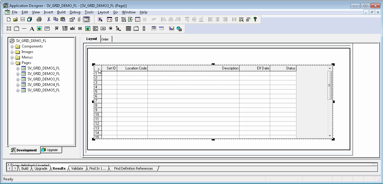
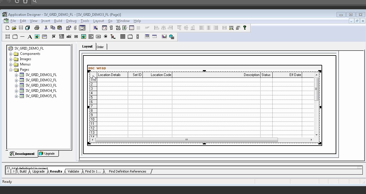
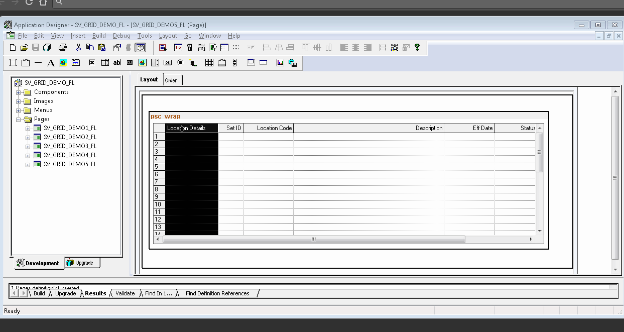
Flex Layout with Stacked Columns:
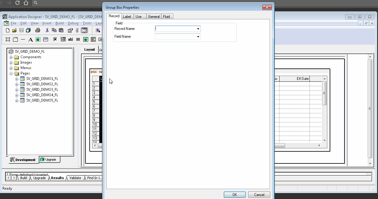
Next, I added a couple of group boxes to the grid in an effort to stack the columns and avoid the horizontal scrolling.

Demo:
By using the 'Stacked Columns' we can see how the horizontal scrolling can be avoided. This is great for a small form factor device. But the problem I have with the 'Stacked Columns' is that it is not maximizing the space available on a larger form factor. Notice all the empty space between the 'Location Details' and 'Status' columns when the grid is rendered on a desktop?

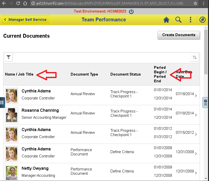
Responsive Flex Grid Layout with 2 Columns:
To avoid the empty space issue that I described in the previous section, one of my colleagues showed me a simple trick to disable column stacking on certain form factors. Simply use the 'Suppress On Form Factor' Fluid Page Field Property on the two group boxes!

Demo:
As we can see, the grid is displayed in a normal 'Flex Layout' when it is rendered on a Desktop (extra large form factor) but is displayed with 'Stacked Columns' when it is rendered on a mobile device (small form factor).

Responsive Flex Layout with Single Column:
Just to provide another option, I wanted to show how we can use a single column display for small form factor. I simply removed the second group box so we only have one group box at the start of the grid.

Demo:
As we can see, by only using one group box in the grid, we can render the entire row in a single column format (if necessary).

Responsive Flex Layout with Labels:
Up until this point, you may have noticed that none of the stacked grid cells had any labels. The idea of using stacked grid is to not only stack the grid columns but also stack the labels. At least, that is what I have observed in some of the delivered pages. For example:

Labels cannot be taken lightly as they play a huge role in making a page accessible (consider screen readers, etc.). What if we want the labels to display beside the cell value while in stacked mode (SSF)? There is a grid field property that we can set to do just that!

This works great when the grid is stacked on a small form factor but causes redundant labels on other form factors (where we have suppressed the stacking).

To workaround this problem, I added page activate peoplecode to conditionally suppress the grid cell labels using css.
CSS - SV_GRID_CSS:
Note: LOCATION_TBL in the selector represents the page field name of the grid.
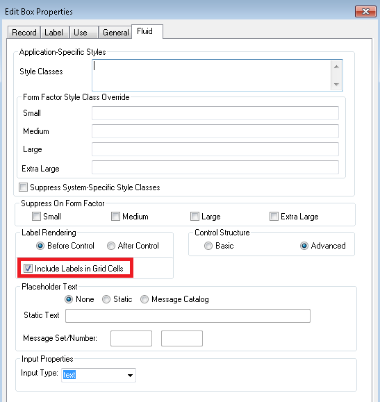
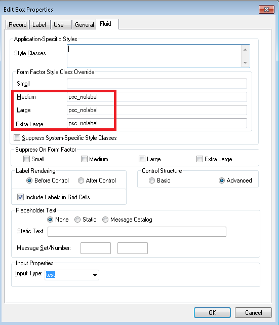
Workaround Option 2: Based on feedback from Stefan in comments below. I figured that we could simply use the Fluid properties to suppress the label in the larger form factors using the 'psc_nolabel' css. If we use this option, we don't need the page activate peoplecode with the conditional form factor logic as described above. Here is a screenshot of the Fluid property.

You might wonder how I figured that we could use 'psc_nolabel' style class? I found it in Appendix 4 (Delivered PeopleSoft Style Classes) of the following document on My Oracle Support:
Converting Classic PIA Components to PeopleSoft Fluid User Interface (Doc ID 1984833.1)
- This appendix has a table of commonly used delivered style classes
Demo:
As we can see, the cell labels appear conditionally in the stacked grid for small form factor.

Environment Details:
- HCM 9.2 PUM Image 23
- PeopleTools 8.56.01
Project Installation Details:
To make it easier for readers, I shared a project on GitHub which contains the 5 demo pages that were created for this post.
GitHub Project: https://github.com/SasankVemana/Fluid-UI-Grid-Demos
Installation Instructions:
- Download the project from GitHub.
- Load the project into your database using 'Tools > Copy Project > From File...' option in App Designer. Note: DO NOT load this in a Production environment.
- You may need to add these pages to a permission list for access.
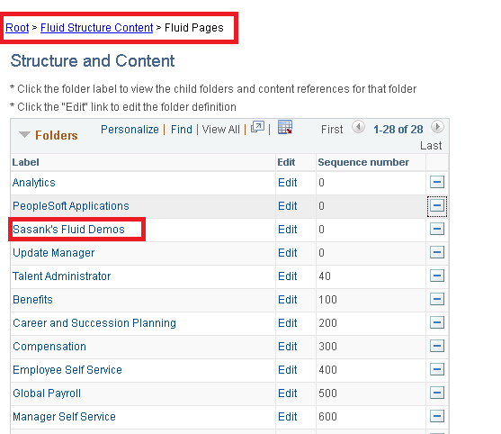
- This project will create a folder under PeopleTools > Portal > Structure and Content > Fluid Structure and Content > Fluid Pages as follows:

- Finally add the Demo Tile to any Homepage using the Personalization option as shown below:

Demo Assumption/Dependency:
- The demo pages use PS_LOCATION_TBL as the record for the grids. This table should exist in most PeopleSoft Applications (HCM, FSCM, CS) and is required for the demo to work.
Other Fluid References:
Jim's PeopleSoft Journal
Jim and Sarah Marion's Book - PeopleSoft PeopleTools: Mobile Application Development
PeopleBooks: http://docs.oracle.com/cd/E65859_01/fluid_ux/index.html
CY2 Fluid Blog: http://cy2.nl/category/peopletools/fluid/
I learnt a lot about grids in Fluid UI while chatting with Stefan van Liempt from CY2. He is one of the top Fluid developers and has several innovative ideas and designs. Watch his blog space here for interesting posts on Fluid (many more to come in the future)!
The following presentation on UI Controls is a must read for anyone who is starting to learn Fluid:
http://cy2.nl/wp-content/uploads/10-Fluid-UI-controls-you-should-know-about.pdf
In this post, I would like to share what I learnt from Stefan's presentation and how one of my colleagues used 'stacked columns' to create responsive grids simply by using Page Field Properties! At the end, I will share a project containing the demo pages with grids detailed in this post.
Classic Grid Layout:
To start off, I created a simple Fluid page containing a Grid with a 'Classic Grid Layout'.
Demo:
We can see that the 'Classic Grid Layout' in Fluid simply creates a grid much like in Classic UI. The grid is not responsive.

Flex Grid Layout:
Next, I changed the Grid Properties to use a 'Flex Grid Layout'.
Demo:
As we can see, the grid has a different (Fluid-like) style with the 'Flex Grid Layout' but the grid is still not responsive.

Flex Layout with Stacked Columns:
Next, I added a couple of group boxes to the grid in an effort to stack the columns and avoid the horizontal scrolling.
Demo:
By using the 'Stacked Columns' we can see how the horizontal scrolling can be avoided. This is great for a small form factor device. But the problem I have with the 'Stacked Columns' is that it is not maximizing the space available on a larger form factor. Notice all the empty space between the 'Location Details' and 'Status' columns when the grid is rendered on a desktop?

Responsive Flex Grid Layout with 2 Columns:
To avoid the empty space issue that I described in the previous section, one of my colleagues showed me a simple trick to disable column stacking on certain form factors. Simply use the 'Suppress On Form Factor' Fluid Page Field Property on the two group boxes!
Demo:
As we can see, the grid is displayed in a normal 'Flex Layout' when it is rendered on a Desktop (extra large form factor) but is displayed with 'Stacked Columns' when it is rendered on a mobile device (small form factor).

Responsive Flex Layout with Single Column:
Just to provide another option, I wanted to show how we can use a single column display for small form factor. I simply removed the second group box so we only have one group box at the start of the grid.
Demo:
As we can see, by only using one group box in the grid, we can render the entire row in a single column format (if necessary).

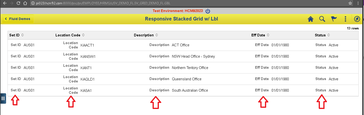
Responsive Flex Layout with Labels:
Up until this point, you may have noticed that none of the stacked grid cells had any labels. The idea of using stacked grid is to not only stack the grid columns but also stack the labels. At least, that is what I have observed in some of the delivered pages. For example:
Labels cannot be taken lightly as they play a huge role in making a page accessible (consider screen readers, etc.). What if we want the labels to display beside the cell value while in stacked mode (SSF)? There is a grid field property that we can set to do just that!
This works great when the grid is stacked on a small form factor but causes redundant labels on other form factors (where we have suppressed the stacking).
To workaround this problem, I added page activate peoplecode to conditionally suppress the grid cell labels using css.
CSS - SV_GRID_CSS:
Note: LOCATION_TBL in the selector represents the page field name of the grid.
Workaround Option 2: Based on feedback from Stefan in comments below. I figured that we could simply use the Fluid properties to suppress the label in the larger form factors using the 'psc_nolabel' css. If we use this option, we don't need the page activate peoplecode with the conditional form factor logic as described above. Here is a screenshot of the Fluid property.
You might wonder how I figured that we could use 'psc_nolabel' style class? I found it in Appendix 4 (Delivered PeopleSoft Style Classes) of the following document on My Oracle Support:
Converting Classic PIA Components to PeopleSoft Fluid User Interface (Doc ID 1984833.1)
- This appendix has a table of commonly used delivered style classes
Demo:
As we can see, the cell labels appear conditionally in the stacked grid for small form factor.

Environment Details:
- HCM 9.2 PUM Image 23
- PeopleTools 8.56.01
Project Installation Details:
To make it easier for readers, I shared a project on GitHub which contains the 5 demo pages that were created for this post.
GitHub Project: https://github.com/SasankVemana/Fluid-UI-Grid-Demos
Installation Instructions:
- Download the project from GitHub.
- Load the project into your database using 'Tools > Copy Project > From File...' option in App Designer. Note: DO NOT load this in a Production environment.
- You may need to add these pages to a permission list for access.
- This project will create a folder under PeopleTools > Portal > Structure and Content > Fluid Structure and Content > Fluid Pages as follows:
- Finally add the Demo Tile to any Homepage using the Personalization option as shown below:
Demo Assumption/Dependency:
- The demo pages use PS_LOCATION_TBL as the record for the grids. This table should exist in most PeopleSoft Applications (HCM, FSCM, CS) and is required for the demo to work.
Other Fluid References:
Jim's PeopleSoft Journal
Jim and Sarah Marion's Book - PeopleSoft PeopleTools: Mobile Application Development
PeopleBooks: http://docs.oracle.com/cd/E65859_01/fluid_ux/index.html
CY2 Fluid Blog: http://cy2.nl/category/peopletools/fluid/