PeopleTools 8.56 has been out for a few months now. This is a review of what is new in the Branding Framework pertaining to the 8.56 release.
Review Environment Details:
- HCM 9.2 PUM Image 23
- PeopleTools 8.56.01
Branding Framework:
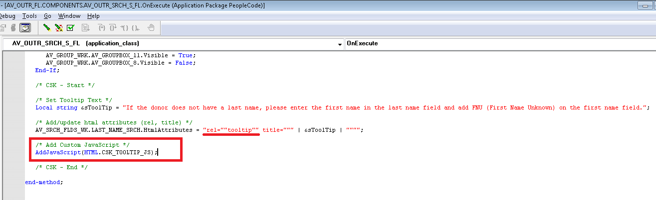
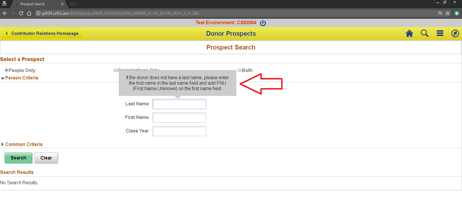
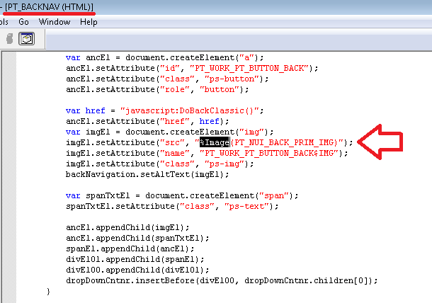
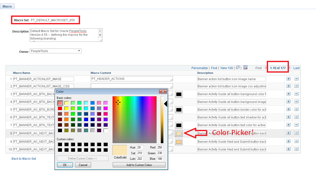
Not much has changed with the Branding Framework. I was expecting some improvements to the Theme Macro Set functionality which was introduced in 8.55. There are still some hard-coded references to images in javascript which would have been nice to move to Theme Macro Set CSS functionality. For example:

The delivered macro set, PT_DEFAULT_MACROSET_855, still contains 117 macros (same as in 8.55) with no changes in 8.56.
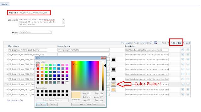
As you can see, there is a new Color Picker on the Theme Macro Set page which is a nice productivity enhancing feature! This Color Picker is based on HTML5 'color' input type element.
Icon Changes:
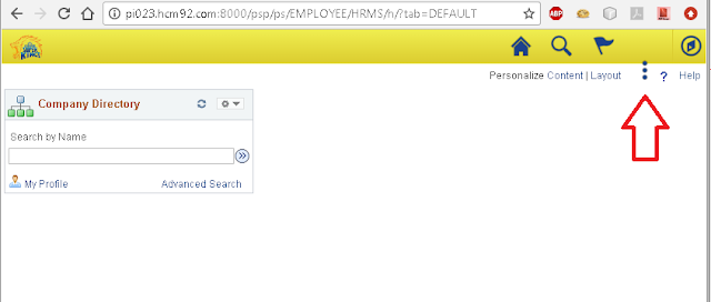
A notable change that we have already seen in demos prior to the release is the new 'Action Menu' icon. This has changed from the old 'hamburger' menu to a 'pea' (?) menu. Graham Smith thinks this is a healthy dietary change! We cannot argue with that. :)

Using Theme Macro Sets:
Since the framework has not changed, it was pretty much the same set of steps to use Theme Macro Sets to override Branding elements. One thing to note is that we definitely want to clone the 8.56 objects (style sheets, headers, themes, etc.) instead of moving objects from an 8.55 environment. This will make sure that we have the most current versions of the object in question.
We can follow the steps detailed in my previous posts describing how to use Theme Macro Sets to override Branding Elements:
PeopleTools 8.55 Branding - Theme Macro Sets - Part 1
PeopleTools 8.55 Branding - Theme Macro Sets - Part 2
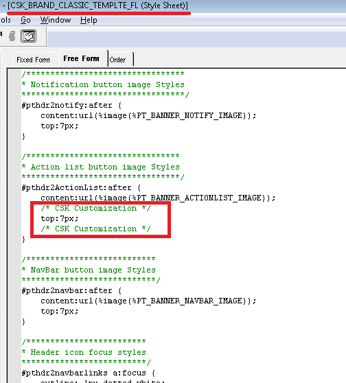
One of the issues I noticed was the position of the 'Pea' icon was a little off after applying the Theme Macro Set overrides. This issue occurred only on the Classic Pages. For example:
I fixed this by adding the following a top property to the #pthdr2ActionList:after style selector which is part of the Classic Theme Style Sheet.
Using Oracle JET:
I noticed that Oracle JET version 2.1.0 is available with PeopleTools 8.56. I found that the JavaScript Injection Framework that I built using Oracle JET in 8.55, works without any issues in 8.56 as well. Only thing to note is that, due to the version change, we may need to review the requireJS configuration to make sure the javascript library paths are pointing to the correct version.
Resources:
JavaScript Injection Framework
Framework is based on my experience with Oracle JET - Part 1, Part 2, Part 3 and Part 4
GitHub Project: https://github.com/SasankVemana/PeopleTools-JavaScript-Injection-Framework
Using Classic Plus:
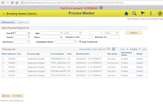
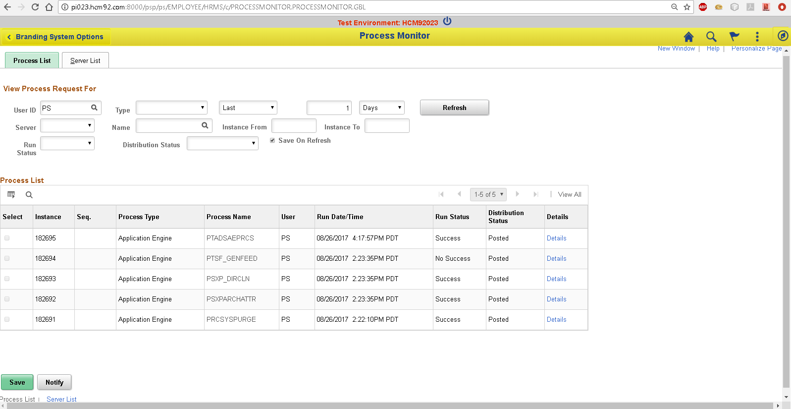
I wanted to test the delivered Classic Plus pages that were available in this PUM image. But when I navigated to the Process Monitor page - which is in the list of PeopleTools Components delivered as Classic Plus - I was still seeing the good old Classic.
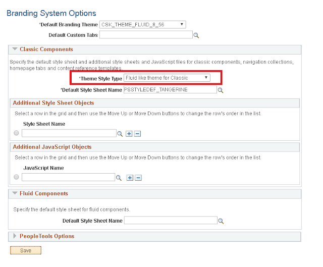
To activate Classic Plus, we must update the Branding System Options to use "Fluid like theme for Classic" as the "Theme Style Type". This is the system level setting that enables "Classic Plus".
Process Monitor after setting 'Theme Style Type'.

More information on Classic Plus:
PeopleBooks - Classic Plus
Related Branding Posts:
Fluid UI - New Window Feature - Workaround
Using Different Branding Themes for Different Portals
Using the Logo as a Hyperlink
Fluid Global Search - Setting Focus on the Search Box
Adding Userid to 'Sign out' Action Menu Item Label
Review Environment Details:
- HCM 9.2 PUM Image 23
- PeopleTools 8.56.01
Branding Framework:
Not much has changed with the Branding Framework. I was expecting some improvements to the Theme Macro Set functionality which was introduced in 8.55. There are still some hard-coded references to images in javascript which would have been nice to move to Theme Macro Set CSS functionality. For example:
The delivered macro set, PT_DEFAULT_MACROSET_855, still contains 117 macros (same as in 8.55) with no changes in 8.56.
As you can see, there is a new Color Picker on the Theme Macro Set page which is a nice productivity enhancing feature! This Color Picker is based on HTML5 'color' input type element.
Icon Changes:
A notable change that we have already seen in demos prior to the release is the new 'Action Menu' icon. This has changed from the old 'hamburger' menu to a 'pea' (?) menu. Graham Smith thinks this is a healthy dietary change! We cannot argue with that. :)

Using Theme Macro Sets:
Since the framework has not changed, it was pretty much the same set of steps to use Theme Macro Sets to override Branding elements. One thing to note is that we definitely want to clone the 8.56 objects (style sheets, headers, themes, etc.) instead of moving objects from an 8.55 environment. This will make sure that we have the most current versions of the object in question.
We can follow the steps detailed in my previous posts describing how to use Theme Macro Sets to override Branding Elements:
PeopleTools 8.55 Branding - Theme Macro Sets - Part 1
PeopleTools 8.55 Branding - Theme Macro Sets - Part 2
One of the issues I noticed was the position of the 'Pea' icon was a little off after applying the Theme Macro Set overrides. This issue occurred only on the Classic Pages. For example:

I fixed this by adding the following a top property to the #pthdr2ActionList:after style selector which is part of the Classic Theme Style Sheet.

Using Oracle JET:
I noticed that Oracle JET version 2.1.0 is available with PeopleTools 8.56. I found that the JavaScript Injection Framework that I built using Oracle JET in 8.55, works without any issues in 8.56 as well. Only thing to note is that, due to the version change, we may need to review the requireJS configuration to make sure the javascript library paths are pointing to the correct version.
Resources:
JavaScript Injection Framework
Framework is based on my experience with Oracle JET - Part 1, Part 2, Part 3 and Part 4
GitHub Project: https://github.com/SasankVemana/PeopleTools-JavaScript-Injection-Framework
Using Classic Plus:
I wanted to test the delivered Classic Plus pages that were available in this PUM image. But when I navigated to the Process Monitor page - which is in the list of PeopleTools Components delivered as Classic Plus - I was still seeing the good old Classic.

To activate Classic Plus, we must update the Branding System Options to use "Fluid like theme for Classic" as the "Theme Style Type". This is the system level setting that enables "Classic Plus".

Process Monitor after setting 'Theme Style Type'.
More information on Classic Plus:
PeopleBooks - Classic Plus
Related Branding Posts:
Fluid UI - New Window Feature - Workaround
Using Different Branding Themes for Different Portals
Using the Logo as a Hyperlink
Fluid Global Search - Setting Focus on the Search Box
Adding Userid to 'Sign out' Action Menu Item Label